
- Created by Silvan Frey on Sep 01, 2026 2 minute read
You have English selected as language but this page has not been translated yet. Translate the page or view the content in the default space language below.
Display defaultDocument Version
Overview
The VicSDK allows every Swiss citizen to share data securely with medical persons using their Android mobile phone. This page and the pages linked on it, describe the setup of version 3.0.0 and onwards. For setup of older versions, follow the PDF guides for these specific versions.
As users are used to access all services using their mobile phone, they expect to be able to do the same within medical processes. Additionally, some digital services cannot be accessed using a smart-card because of technical limitations. This SDK provides a useful alternative for users who do not want to carry a physical card and opens the door to new processes.
Versioning
v2.6.10 | v3.0.x | v3.1.x | |
|---|---|---|---|
| Minimum Android SDK version supported | 24 | 24 | 24 |
| Current Target Android SDK version | 35 | 35 | 37 |
| Kotlin Version | 1.9.0 | 2.2.21 | 2.4.0 |
| Gradle Version | 8.10 | 8.14.3 | 9.6.0 |
| Android Gradle Plugin | 8.2.0 | 8.13.2 | 9.2.1 |
Compatibility
The SDK is tested on multiple different devices from various brands (Samsung, OnePlus, Huawei, Google, …).
Key features
• Looks the same for all insurances, to reduce confusion at medical care providers
• Add several insurance cards, according to the family structure of your insurance
• Check-in at a medical care provider with the use of a printed QR code
• Receive a strong verification from a medical person or an insurance
• Use this verification in other medical processes and web portals
• Customize colors and fonts to match your insurance branding
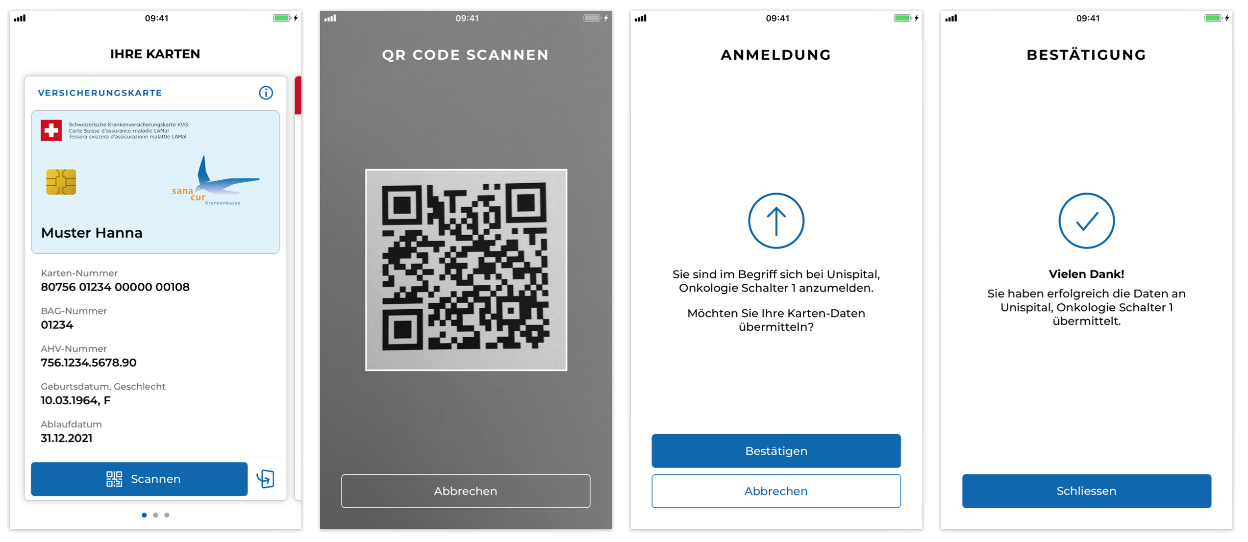
Setup via Maven
Gradle
- Add the SASIS Maven repository to your project in the settings.gradle.kts file:setup.gradle.kts
dependencyResolutionManagement {
    repositoriesMode.set(RepositoriesMode.FAIL_ON_PROJECT_REPOS)

    repositories {
		// other repositories
        google()
        mavenCentral()
	    // mavenLocal()

		// sasis repository
        maven {
            name = "sasis"
            url = uri("https://pkgs.dev.azure.com/SASISAG/VICSDK/_packaging/VICSDK-Android/maven/v1")

            credentials(PasswordCredentials::class)
            authentication {
                create<BasicAuthentication>("basic")
            }
        }
    }
}
Beta releases
If you are a beta tester, we will provide a separate repository link and AccessToken for beta releases. The setup itself works the same way.
- Add the credentials to the gradle.properties file. As username, everything can be used, as password, the provided access token from SASIS should be used.gradle.properties
sasisUsername=anything
sasisPassword=<AccessToken>
The AccessToken will be provided via email. If you don't have an AccessToken, please contact us.
- Add the VicSDK dependency
Identifier Version ch.sasis:vicsdk
3.1.0libs.version.toml[versions]sasis = "3.1.0" [libraries] sasis-vicsdk = { module = "ch.sasis:vicsdk", version.ref = "sasis" }build.gradle.kts // app-leveldependencies { implementation(libs.sasis.vicsdk) } - Enable Compose if not done alreadybuild.gradle.kts // app-level
android {
    buildFeatures {
        compose = true
    }
}
Manifest
From 3.1.0:
To support Android 17 the back of the card is now generated as image with the right aspect ratio. Portrait only is not guaranteed anymore, so the android:screenOrientation="portrait" can be deleted.
Before 3.1.0:
The cardview currently only supports portrait-mode. So the Activity displaying the cards should force portrait mode in the manifest.
<activity android:name=".MyCardsActivity"
	android:screenOrientation="portrait"></activity>
ProGuard
The following ProGuard rules are required by the SDK to allow minification (not needed from version 3.1.0 anymore)
-keep class com.sun.jna.** { *; }
-keep class ch.sasis.vicsdk.** { *; }
Integration
Integration
Import dependencies
Import the VIC SDK in your app and customize it:
- Import the ch.sasis.vicsdk package in your MainApplication:
import ch.sasis.vicsdk.VicSdk
- Configure the VicSdk shared objects, typically in your application’s onCreate method:
override fun onCreate() {
	super.onCreate()

    val vicSettings = VicSettings.Builder()
					    .setCardImage(your_card_image)
						.build()
    VicSdk.init(context = this, vicSettings = vicSettings)
}
Customize the look and feel of the SDK by using the VicSettings builder. For more infos refer to the customization section.
VicSDK Card Presentation Flow

The original mermaid diagram can be found here.
Cards
The cards of all the family members can be shown by the VIC SDK. These can then be used to scan a QR code and transmit a signed/verified version of the card to a third party such as a hospital.

Show cards
Before showing the user’s cards, the insurer application needs to fetch the user’s VekaNr claims from the insurer server and pass them to the VIC SDK.
The list of VekaNr claim has to be provided as a JSON array of public PASETOs v2, with one PASETO corresponding to one VekaNr claim. This enables the VIC SDK to authenticate to the SASIS server and fetch the data of all the cards.
After fetching the VekaNr claims, pass them to the VIC SDK by calling the setVekaNrClaims function as follows:
VicSdk.setVekaNrClaims(vekaNrClaims)
The fragment for the cards can then be shown, for example on a FrameLayout element on the card-activity of your application:
Customization
Environment
You can set the environment for the VicSdk. The Environment defines, which Sasis Backend will be called, StageNext or Production. The default is set to production.
val vicSettings = VicSettings.Builder()
    					.setEnvironment(env = VicEnv.DEV)
    					// other builder methods
						.build()
The VicEnv is defined like this:
enum class VicEnv {
    DEV, PROD, STAGE
}
Language
In order to change the language of the VIC SDK, call the setLanguage(context: Context, language: VicLang, shouldRecreate: Boolean = false) method of the VicSdk class:
VicSdk.setLanguage(context, VicLang.DE)
The languages supported by the VIC SDK are: German, English, Italian, French.
enum class VicLang {
    DE, FR, EN, IT
}
The Context should be an Activity Context. The shouldRecreate flag determines whether or not the activity (context) should be recreated immediately for the language settings to take immediate effect.
— Attention — If the language of the SDK changes after the CardsActivity is created, the Activity must be recreated for the language change to take effect.
To pass the Language-Setting to the Base-Context of the Application, The method attachBaseContext has to be overriden in the CardsActivity with the LocaleHelper of the SDK.
override fun attachBaseContext(newBase: Context?) {
	super.attachBaseContext(newBase?.let{ VicLocaleHelper.onAttach(it) })
}
FontFamily
For customizing the text displayed by the VicSdk, you can set the Fonts using setFontFamily(vararg fonts: VicFont):
(Since 3.1.1 the old method setFontFamily(fontFamily: FontFamily) is deprecated, in favor of compose independence)
val fonts = arrayOf(
    VicFont(
        fontRes = ...,
        weight = ...,
        italic = ...
    ),
	...
)
val vicSettings = VicSettings.Builder()
                        .setFontFamily(fonts = fonts)
                        // other builder methods
						.build()
The VicFont has the following properties:
data class VicFont(
    @FontRes val fontRes: Int,
    val weight: Int = 400,
    val italic: Boolean = false,
)
Colors
To change appearance colors you can use the method setColorScheme(colors: VicColorScheme). Internally the VicSdk follows the Material 3 color scheme. You can set your colors as followed:
(Since 3.1.1 the old method setColorScheme(colorScheme: ColorScheme) is deprecated, in favor of compose independence)
val colorScheme = VicColorScheme(...)
val vicSettings = VicSettings.Builder()
                        .setColorScheme(colors = colorScheme)
                        // other builder methods
						.build()
The VicColorScheme has the following properties:
data class VicColorScheme(
    @ColorInt val primary: Int? = null,
    @ColorInt val onPrimary: Int? = null,
    @ColorInt val primaryContainer: Int? = null,
    @ColorInt val onPrimaryContainer: Int? = null,
    @ColorInt val inversePrimary: Int? = null,
    @ColorInt val secondary: Int? = null,
    @ColorInt val onSecondary: Int? = null,
    @ColorInt val secondaryContainer: Int? = null,
    @ColorInt val onSecondaryContainer: Int? = null,
    @ColorInt val tertiary: Int? = null,
    @ColorInt val onTertiary: Int? = null,
    @ColorInt val tertiaryContainer: Int? = null,
    @ColorInt val onTertiaryContainer: Int? = null,
    @ColorInt val background: Int? = null,
    @ColorInt val onBackground: Int? = null,
    @ColorInt val surface: Int? = null,
    @ColorInt val onSurface: Int? = null,
    @ColorInt val surfaceVariant: Int? = null,
    @ColorInt val onSurfaceVariant: Int? = null,
    @ColorInt val surfaceTint: Int? = null,
    @ColorInt val inverseSurface: Int? = null,
    @ColorInt val inverseOnSurface: Int? = null,
    @ColorInt val error: Int? = null,
    @ColorInt val onError: Int? = null,
    @ColorInt val errorContainer: Int? = null,
    @ColorInt val onErrorContainer: Int? = null,
    @ColorInt val outline: Int? = null,
    @ColorInt val outlineVariant: Int? = null,
    @ColorInt val scrim: Int? = null,
    @ColorInt val surfaceBright: Int? = null,
    @ColorInt val surfaceDim: Int? = null,
    @ColorInt val surfaceContainer: Int? = null,
    @ColorInt val surfaceContainerHigh: Int? = null,
    @ColorInt val surfaceContainerHighest: Int? = null,
    @ColorInt val surfaceContainerLow: Int? = null,
    @ColorInt val surfaceContainerLowest: Int? = null,
)
Button colors (since v3.0.2)
Button colors for the different button styles can be customized by setting setButtonColors(type: VicButtonColors, colors: VicButtonColorConfig) (since 3.1.1):
(Since 3.1.1 the old method setButtonColor(vicButtonColors: VicButtonColors, buttonColors: ButtonColors) is deprecated, in favor of compose independence)
val vicSettings = VicSettings.Builder()
                        .setButtonColor(
							vicButtonColors = VicButtonColors.PRIMARY,
							buttonColors = VicButtonColorConfig(
								container = ...,
                    			content = ...,
                    			disabledContainer = ...,
                    			disabledContent = ...
							)
                        )
                        // other builder methods
						.build()
The VicButtonColors is defined like this:
enum class VicButtonColors {
    PRIMARY, PRIMARY_INVERTED, SECONDARY, SECONDARY_INVERTED
}
TheVicButtonColorConfig is defined like this:
data class VicButtonColorConfig(
    @ColorInt val container: Int,
    @ColorInt val content: Int,
    @ColorInt val disabledContainer: Int? = null,
    @ColorInt val disabledContent: Int? = null,
)
Dimensions
There are 4 dimension tokens that can be customized. These can be set with setDimensionToken(vicDimenToken: VicDimenTokens, tokenValueDp: Float):
(Since 3.1.1 the old method setDimensionToken(vicDimenToken: VicDimenTokens, tokenValue: Dp) is deprecated, in favor of compose independence)
val vicSettings = VicSettings.Builder()
                        .setDimensionToken(vicDimenToken = VicDimenTokens.BUTTON_BORDER_RADIUS, tokenValue: 4.0f)
                        // other builder methods
						.build()
The VicTutorialScreen is defined like this:
enum class VicDimenTokens {
    BUTTON_BORDER_RADIUS, BUTTON_BORDER_WIDTH, CARD_BORDER_RADIUS, CARD_BORDER_WIDTH
}
Text styles
The text styles of the text fields can be customized by setting a separate TextStyle for each of them by using setTextStyle(vicTextStyles: VicTextStyles, vicTextStyleConfig: VicTextStyleConfig)
(since v3.0.2, the old method setTextStyle(vicTextStyles: VicTextStyles ,textStyle: TextStyle), and since 3.1.1 the old setTextStyle(vicTextStyles: VicTextStyles, vicTextStyle: VicTextStyle) are deprecated, in favor of compose independence):
val textStyle = TextStyle(
    fontSize = 24.sp,
	color: Color.Gray
)
val vicSettings = VicSettings.Builder()
                        .setTextStyle(
							vicTextStyles = VicTextStyles.PAGE_TITLE,
                            vicTextStyleConfig = VicTextStyleConfig(...)
						)
                        // other builder methods
						.build()
The following text fields can be customized (defined in VicTextStyles):
enum class VicTextStyles {
    PAGE_TITLE,
    INVERTED_PAGE_TITLE,
    SUBHEAD,
    COPYTEXT,
    BOLD_COPYTEXT,
    INVERTED_COPYTEXT,
    NOTIFICATION_BANNER,
    ERROR_BANNER,
    CARD_TITLE,
    CARD_OVERVIEW_INSURED,
    CARD_OVERVIEW_EXPIRYDATE,
    CARD_OVERVIEW_EXPIRED,
    CARD_INSURED,
    CARD_FRONT_LABEL,
    CARD_FRONT_VALUE,
	CARD_FRONT_DESCRIPTION, // since v3.0.2
    BUTTON_PRIMARY,
    BUTTON_PRIMARY_INVERTED,
    BUTTON_SECONDARY,
    BUTTON_SECONDARY_INVERTED
}
The VicTutorialScreen is defined like this:
data class VicTextStyleConfig(
    val fontSizeSp: Float? = null,
    val lineHeightSp: Float? = null,
    val letterSpacingSp: Float? = null,
    val fontWeight: Int? = null,
    @ColorInt val color: Int? = null,
    @FontRes val fontFamilyRes: Int? = null,
    val uppercase: Boolean = false
)
Tutorial screens
With the method setTutorialScreens(screens: List<VicTutorialScreen>) you can define, which tutorial screens should be shown to the user. An empty List disabled the tutorial. Defaults to all screens from the enum:
val vicSettings = VicSettings.Builder()
                        .setTutorialScreens(screens = listOf(VicTutorialScreen.WELCOME_SCREEN, VicTutorialScreen.QR_CODE_SCREEN, ...))
                        // other builder methods
						.build()
The VicTutorialScreen is defined like this:
enum class VicTutorialScreen {
    WELCOME_SCREEN, QR_CODE_SCREEN, BARCODE_SCREEN, NFC_SCREEN, BACK_OF_CARD_SCREEN
}
Card-Data
On the Front Card, by default, card data attributes in following order are shown:
CARD_NUMBER, BAG_NUMBER, AHV_NUMBER, BIRTHDATE, EXPIRY_DATE, BARCODE, WALLET
The visibility and order of those attributes can be changed by using setCardListItems(cardListItems: List<VicCardListItem>):
val vicSettings = VicSettings.Builder()
                        .setCardListItems(cardListItems = listOf(VicCardListItem.CARD_NUMBER, VicCardListItem.BAG_NUMBER, ...))
                        // other builder methods
						.build()
The VicTutorialScreen is defined like this:
enum class VicCardListItem {
    CARD_NUMBER, BAG_NUMBER, AHV_NUMBER, BIRTHDATE, EXPIRY_DATE, BARCODE, POLICY_HOLDER, WALLET
}
Card customization
To customize card by type or cardNumber, you have the following options:
(Since 3.1.1 VicCardConfig, setCardDefaultConfigKVG(cardConfig: VicCardConfig) and setCardDefaultConfigVVG(cardConfig: VicCardConfig) are deprecated, in favor of compose independence)
- Setting default card config with setCardDefaultConfigKVG(cardStyle: VicCardStyle) and setCardDefaultConfigVVG(cardStyle: VicCardStyle)VicSettings Builder - setCardDefaultConfigurationKVG() / setCardDefaultConfigurationVVG()
val vicSettings = VicSettings.Builder()
                        .setCardDefaultConfigKVG(cardStyle = VicCardStyle(...))
						.setCardDefaultConfigVVG(cardStyle = VicCardStyle(...))
                        // other builder methods
						.build()
- Setting runtime configurations per card after the SDK is initialized with VicSdk.configureCard(cardNumber: String, cardStyle: VicCardStyle)VicSdk - configureCard()
VicSdk.configureCard(
    cardNumber = "80756012340000000033",
    config = VicCardStyle(
        cardFrontImageRes = R.drawable.card_view_kvg_premium_background,
        textColor = "#FFFFFF",
        secondaryTextColor = "#CF0415",
    )
)
The VicCardConfig has the following optional properties:
data class VicCardStyle(
    @DrawableRes val cardFrontImageRes: Int? = null,
    @DrawableRes val cardBackImageResVVG: Int? = null,
    val textColor: String? = null,
    val secondaryTextColor: String? = null,
    val freeFieldText: String? = null,
    val freeFieldTextStyleVVG: VicTextStyleConfig? = null,
    val hideMagneticStrip: Boolean? = null
)
Rules for configuration
- If a VicCardConfig for a card exists and the property is set, this value is used.
- If no VicCardConfig for a card exists or the property is not set, the value is looked up in the corresponding default config for the specific card type
- If no default config is available, or the property isn't set in the default config, SDK defaults will be used.
→ default image background for the front image is:
→ default background for back image is white
→ default color for the colors is: "#000000"
→ default string for the strings is: ""
Background images
- The card image should have a form factor of 1:1.73 e.g.: 945x546 pixel.
- The logo is to be placed in the right half of the image
- The logo must be horizontally right aligned and vertically centered.
- The maximum size of the logo is 70% width and 60% height of the total image.
Complementary Card Backside
Showing the backside of complementary cards can be enabled/disabled (per insurance not per card). Default: enabled. To disable use
val vicSettings = VicSettings.Builder()
                        .setShowComplementaryCardBackside(showComplementaryCardBackside = false)
                        // other builder methods
						.build()
This disables the rotation when clicking on the card frontside and also hides the rotation button
Card Backside English
The european backside of cards can be shown in English regardless of the language set for the app.
Default: false. To set English as default for the backside use
val vicSettings = VicSettings.Builder()
                        .setEnglishEuropeanCardEnabled(enabled = true)
                        // other builder methods
						.build()
Policy Number Label Alternative
The label of the policy number can show an alternative text. The alternative texts are as following:
- EN: Insured person no.
- DE: Versicherten-Nr.
- FR: N° d’assuré(e)
- IT: Numero d’assicurato
Default: false. To use the alternative labels use
val vicSettings = VicSettings.Builder()
                        .setUseAlternativeLabelForPolicyNumber(enabled = true)
                        // other builder methods
						.build()
Wallet
From version 3.0.0 of the VicSdk, the SDK supports Google Wallet integration.


When adding the card to Google Wallet the signing of the Wallet Pass is done via the Sasis backend.
To enable Google Wallet integration, you have to set the VicWalletConfig. This can be done with setWalletConfiguration(walletConfig: VicWalletConfig) as global configuration:
val vicSettings = VicSettings.Builder()
                        .setWalletConfiguration(
							walletConfig = VicWalletConfig(
							    logoUrl = "https://...",
                    			heroImageUrl = "https://...",
                    			backgroundColor = "#FF0000"
							)
						)
                        // other builder methods
						.build()
Setting runtime configurations per card after the SDK is initialized with VicSdk.configureCardWallet(cardNumber: String, walletConfig: VicWalletConfig)
VicSdk.configureCardWallet(
    cardNumber = "80756012340000000033",
    config = VicWalletConfig(
		logoUrl = "https://...",
        heroImageUrl = "https://...",
        backgroundColor = "#FF0000"
	)
)
The exact sizes and formats are defined by Google and can be found here: Google Wallet brand guidelines
If no config is set, or the users phone doesn't support Google Wallet, the wallet button will stay hidden.
The VicWalletConfig has the following optional properties:
data class VicWalletConfig(
    val logoUrl: String,
    val heroImageUrl: String,
    val backgroundColor: String = "#ebebeb"
)
Changelog
New Features
- [VIC-110] Jetpack Compose independence
Bugfixes
- [VIC-108] VicSettings.Builder() issues
- [VIC-109] WalletButton errors for some languages
- [VIC-113] Randomly Overlapping screens
v3.1.0
New Features
- [VIC-92] Configurable Magnetic-Strip for cards back view
- New optional boolean property hideMagneticStrip on VicCardConfig
- [VIC-47] Support for Android 16 and 17
- [VIC-95] Loading-indicator when initially displaying Cards instead of "no cards"
- [VIC-83] Per card configuration for Wallet Passes
- Added new runtime function VicSdk.configureCardWallet(cardNumber: String, walletConfig: VicWalletConfig)
Bugfixes
- [VIC-93] HTTP-Logging behavior
- For production log behavior set to NONE to match iOS
- [VIC-103] irregular ArrayIndexOutOfBoundsException on recomposition
- [VIC-104] Error when secondaryTextColor is missing
v3.0.2
Bugfixes & changes
- [VIC-96] Changes of color settings and TextStyles
- Added VicTextStyle data class with textStyle and uppercase configuration option with new method setTextStyle on VicSettings.Builder()
- Previous method setTextStyle ist deprecated
- New configuration option for VicButtonColors Enum and new method setButtonColor on VicSettings.Builder()
- Small changes on style and spacing, to get closer to how XML styling worked before
- [VIC-97] Bugfix: NullPointerException when loading cached cards
- [VIC-100] Removed EULA
v3.0.1
Bugfixes
- [VIC-90]: Typo correction getCradNumbers() → getCardNumbers()
- [VIC-91]: Fix color of info icon and title text default color
v3.0.0
Breaking Changes
- [VIC-1] Architectural changes and naming
- VicSdk API visibility changed (only API documented are visible now)
- LocaleHelper and all enums are newly prefixed with Vic (e.g. VicLocaleHelper)
[VIC-8] UI migration from XML to Jetpack Compose
- Customization done with VicSettings instead of XML
- [VIC-11] Changed package path to ch.sasis.vicsdk
New Features
- Google Wallet integration
Internal changes
- [VIC-2] Fixed null safety issues
- [VIC-6] Dependency update
[VIC-22] Migration from Java to Kotlin (now 100% Kotlin Code)
v2.6.10
[VIC-38] Remove Verdana font
[VIC-44] Edge-to-edge support
v2.6.9
[SDSAS-22] Change: Improve placement of name in card
v2.6.8
[SDSAS-9] Bugfix: Backside of card switches to frontside after some swipes
[SDSAS-8] Add alternative policy number label
v2.6.7
[CSC-99860] Bugfix: Personal identification number not displayed fully on Pixel 8
[DEVVEKA-1996] Add Policy number to disoplayed card data
v2.6.6
[DEVVEKA-2273] Update dependencies
[DEVVEKA-1997] Add Zero infront of the date of birth if it starts with a single digit on the european backside
[DEVVEKA-1783] Prepare for Android 14
[DEVVEKA-1996] Add the insurance number to the frontside of the VICARD
[DEVVEKA-2273] Raise minimum SDK to 24 and target SDK to 34
v2.6.5
Update dev url (please update to this version if you use dev environment)
v2.6.4
[DEVVEKA-1665] Display BAG number with 5 digits
[DEVVEKA-1696] Make showing of the complementary card back configurable
[DEVVEKA-1697] Make mandatory card back free field customizable per card number
[DEVVEKA-1703] Display fullscreen barcode on clicking on the image
[DEVVEKA-1750] Make inner card text customizable separately
[DEVVEKA-1787] Enable card backside english
[DEVVEKA-1851] Fix crash when user sets device font size too large
Migrate to version 17.0.2 of mlkit barcode scanning (see Documentation for latest dependencies)
v2.6.3
[VEKA-1751] Change checkin time format to 24h.
v2.6.2
[VIC-820] Change targetVersion to API 31
fixes compatibility with targeted API 31 host apps, no breaking change
v2.6.1
[VIC-852] Handle invalid QR-Code scan
v2.6.0
[VIC-776] Implement long press copy gesture for card data
[VIC-807] Implement custom card info list order
[VIC-811] Define mandatory card back font
[VIC-819] Migrate from FirebaseApp to ML Kit Barcodes
[VIC-819] Update Dependencies, remove jcenter, bintray and google-services
[VIC-825] Resolve Issue with Paseto Token
[VIC-826] Fix fast click on tutorial screen
v2.5.5
[VIC-839] Make inner card text color customizable
v2.5.4
[VIC-824] Improvement of text sizes in back-card
[VIC-833] Update front-card size for small images
[VIC-837] Change material buttons to AppCompat buttons
v2.5.3
[VIC-819] migrate to version 5.0.2 of lazysodium
v2.5.2
bugfix: align button text in center of buttons
v2.5.1
[VIC-817] Checkin screen corrections
Update Kotlin, Gradle, Dependencies
v2.5.0
[VIC-778] Implement setCardImage for individual card numbers
[VIC-804] bugfix: Scaling of the card background in CardBackView
[VIC-805] bugfix: prevent card attributes from shifting after resume
Update Dependencies
Migrate from Kotlin Synthetics to View Binding
v2.4.0
[VIC-775] Implement Liechtenstein card handler
[VIC-782] Fix ui bug when card owner name too long
[VIC-783] Make visible tutorial screens configurable
v2.3.1
bugfix: use default cardType if cardType is empty string
v2.3.0
[VIC-762] Implement complementary Cards (VVG, Zusatversicherungen)
v2.2.0
[VIC-677] Improve Lifecycle of QrScanActivity (better support for Devices of API level 21 to 23)
updated Gradle dependencies, check chapter Setup in vic-android Documentation v2.2.0
[VIC-756] Fetch issuedAt-Timestamp per Token from ViC-Backend
updated Gradle dependencies, check chapter Setup in vic-android Documentation v2.2.0
v2.1.1
[VIC-761] prevent invalid cards from scanning of qr codes
v2.1.0
[VIC-704] add two new Screens to Tutorial (NFC and Barcode )
v2.0.0
Breaking changes
[VIC-641] Rewrite user customization settings.Whereas the language, card-images and swipe switch are still defined in the VicSettings Object, all other possible android customizations can now be set in an xml file under the
/res/valuesfolder of the application. the User can now customize even more aspects of the SDK, from background colors, font family/size and so.Please be aware that this is a breaking change from the previous version.The new customization settings are fully explained in the documentation, please refer to that to know more.
New Features
[VIC-719] In VicSettings the swipe-function can now be switched off and on.
[VIC-717] When swipe-function is switched off, the cards are selected by number in a slider.
v1.2.0
no changes
v1.1.7
Correctly show invalid/blocked cards
Fixed bug related to fingerprint no longer being required
v1.1.4
Fingerprint sensor is no longer a hard-requirement
v1.1.3
[VIC-684] handle invalid and blocked cards
Display correct image when selecting a card after deeplink (NFC or QR scan from system camera)
v1.1.2
[VIC-646] add new method 'fetchCards' with cards array as callback fun fetchCards(context: Context): Observable<Array<Card>> {…}
Added more translations
parsing of AHV number
v1.1.1
Fixed Bug in Date Parsing
Changed Gender Display to show value in card data
v1.0.0
Release initial version of the Vic Android SDK
- No labels